A Writing Room, Built by Opus 5
I gave Opus 5 a brief for a small writing tool: show someone their own words two ways, change one thing between them, and let them choose by reading. It built the thing, wrote the tests, and reported that they all passed. Then I looked at the screen.
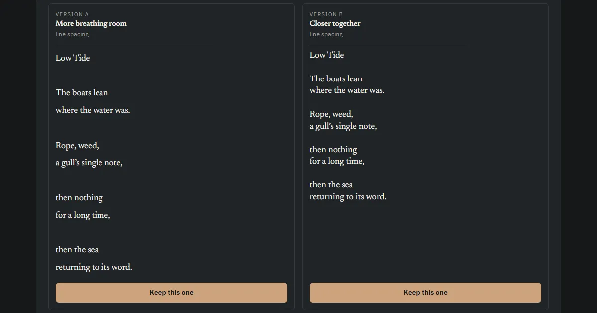
Most writing tools ask you to choose a typeface. That is a hard question to answer in the abstract, and an easy one to answer badly, because the sample text is never yours. A specimen sheet reads beautifully. Your own paragraph, at the width and spacing you actually use, may not.
So the brief I wrote asked a narrower question: of these two, which reads better?
Two versions of the same text, the reader’s own text, with exactly one property changed between them. The difference named in plain language, “More breathing room” against “Closer together”, with a small factual note underneath saying what had actually moved, in this case line spacing. Choose one, and it goes into the page you are reading; then the next pair changes something else. No scores, no recommendation, no claim that one is better.
The constraint that mattered most was the one about the words. Presentation may change; the writing may not. Every line break a poet put in stays where it was put. Indentation that carries meaning in technical writing survives intact. Nothing is rewritten, nothing is reflowed, and no break is invented for effect.
I gave the brief to Opus 5, one of Anthropic’s Claude models, and asked it to build somewhere other than my machine. It took a throwaway Linux box over SSH, from ssh railway.new, which hands you a container and a preview URL without an account. The first box came with a build window, and the window closed while the work was still in progress. That turned out to be the least interesting problem of the day.
What it got right
The discipline around the text held. Every piece of writing goes onto the page as text and never as markup, so nothing a reader pastes can be interpreted as anything other than what it is. Poems and technical writing are rendered verbatim, with the whitespace preserved as typed. Only prose is split into paragraphs, and only because paragraph spacing cannot be compared without paragraphs to space.
I gave it the awkward case deliberately: a fragment carrying −196 °C, 0.07 mK, a drift figure of ±0.4 mK/h, four-space and eight-space code indentation, and a numbered list. Symbols, units and indentation came through every view unaltered, including the printed page.
It made one judgement I would not have thought to specify. When the property under test is the width of the column, showing the two versions side by side would squeeze each into half the screen, which is precisely the thing being judged. So in that one case, and only that one, the two versions stack full width instead. A 64ch measure cannot be assessed in a half-width card.
It also wrote fifty-two tests that run without a browser, driving the page against a stub. They cover the things that would fail quietly: that the exported style never contains the writing, that a cancelled tour restores exactly what was there before, that preferences hold presentation and nothing else.
Here is the result. It is the same page, embedded.
Paste something of your own into it. Open it in its own tab if the frame feels tight.
What it could not see
I opened the page and sent back a screenshot of one panel. The tour of complete looks was running, at look three of eight, with the name and description showing and the four controls beneath. Sitting above all of it, still visible, was the button that starts the tour.
The cause was ordinary. The button sits in a row laid out with display: flex, and the code had correctly set the hidden attribute on it. But an author stylesheet outranks the browser’s own, so display: flex quietly overrode the display: none that hidden is supposed to carry. The element’s state was right. Its appearance was not.
The test suite had checked that the element was hidden. It asserted the state, found it correct, and passed.
That is the same gap I spend my working life on, moved into a different discipline. A calibration certificate is honest about what happened in the laboratory and says nothing about the gradient down the thermowell. A passing test is honest about the state of the object and says nothing about the pixels. Both are accurate. Neither is sufficient on its own, and the failure is invisible from inside the measurement.
The fix took one line, applied globally rather than to the single button, since two other elements would have hit it later.
The quieter tidying
One thing it had done early was load the typefaces from Google, which is the ordinary way to do it and sends every reader’s IP address to a third party for the privilege. Serving the three font files from the site itself costs about 190 KB and removes the question rather than disclosing it. The open licences travel with the files, as they are required to. With no external origin left anywhere on the page, the content security policy collapses to default-src 'self'.
No cookies are set, so there is nothing that needs a banner. The switch that remembers your preferences is off until you turn it on, and it keeps your choices about spacing and width, never a word of your writing.
None of that was in the brief. It is the sort of thing worth doing anyway, and it is cheaper to do at the start than to explain later.
Where that leaves it
The build is genuinely good. The part I would have found tedious, the careful handling of whitespace so that a poem survives four different views unchanged, was done thoroughly and tested properly. The judgement about column width is better than the brief I wrote.
And it worked for hours on an interface it could not look at, reporting with justified confidence that everything passed, while a button sat on the screen that should not have been there.
It knew that the button was hidden. It could not see that the button was still there.