Understanding Customer Information Systems: Building a Live Train Display
Building a Real-Time Train Display: A Practical Project for Everyday Information
AITECH
4/18/20252 min read


Building a Live Train Display: Blending Practicality and Playfulness
There's something quietly captivating about train timetables — the promise of movement, the rhythm of arrivals and departures, the unexpected poetry of a platform announcement. Recently, I decided to capture a little of that magic at home by building a live train display.
The idea started simply: I wanted a small, always-on dashboard showing real-time departure and arrival information for my local stations — Meols Cop and Southport. But as with many projects, it grew into something more layered: a conversation between technology, design, and daily life.
The Build
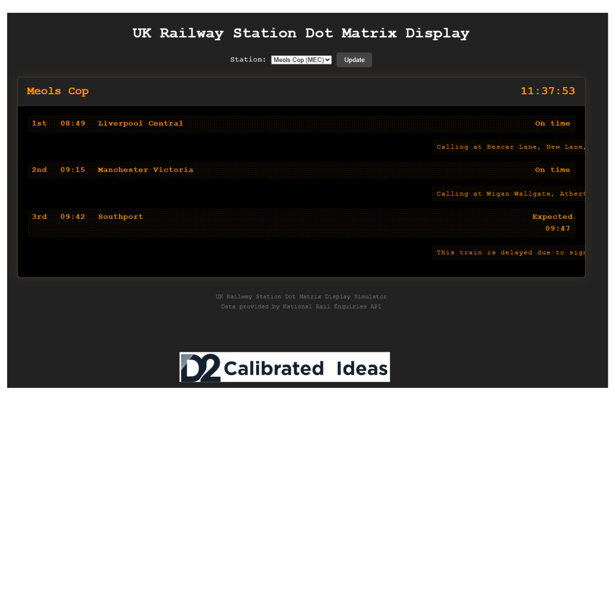
At the heart of the project is a Node.js application intended to connect to the Darwin Push Port, a service that streams live UK rail data. I’ve built the foundations — the server, the basic dashboard, and the styling — but the live data feed isn’t fully wired up yet.
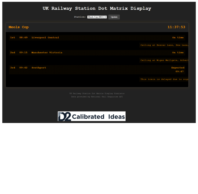
For now, the display scrolls placeholder text and sample announcements, giving me a feel for the look, flow, and readability while I continue to refine the backend.
Key goals for the build:
Accuracy and Speed: Near real-time updates, without heavy page loads or complex refreshes.
Local Relevance: Focused only on my two nearest stations.
Simplicity: No clutter, just clean, readable information, suitable for a small wall-mounted display or browser tab.
In designing the display, I took inspiration from Customer Information Systems (CIS) — the familiar low-resolution boards seen on station platforms, bus stops, and subway systems.
CIS displays, also called Passenger Information Displays (PIDs), are designed to deliver clear, up-to-date information about services. They typically show arrival and departure forecasts, disruption details, and even specifics like train formation — such as the number of coaches, disabled access, and where first-class coaches are located.
Their simple, bold design is intentional: high visibility and quick readability are critical for passengers making fast decisions in busy environments. I wanted my project to echo that clarity and practicality.
Even in its early, scrolling-text form, the display feels alive — a small reminder of the constant movement beyond my front door.
Reflections
There's a certain joy in small projects like this: they’re achievable, personal, and infused with quiet meaning. I didn't just build a dashboard; I built a small window into the rhythm of my own daily world.
For me, it's another example of where calibrated ideas meet real life — where technology serves presence, not just productivity.
What's Next?
I’m already thinking about expanding the project once the live data is fully flowing:
Station Status Alerts: Quick summaries if there’s major disruption.
Get Live Data Working!: That's currently a battle.
Ham Radio Twist: Maybe even integrating the display with Home Assistant and linking it to my amateur radio dashboard.
Like the trains it displays, this project is always arriving somewhere new.
Connect
Please Get in Touch
Services About Contact Privacy Policy / Cookies / Legal
Personal Projects: Photography | Poetry | Blog
© 2025. All rights reserved


