A Piece of Type, Built by Opus 5
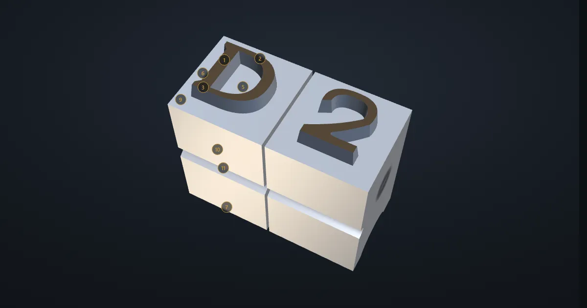
I have been fascinated by printing since a friend showed me a Victorian block. One prompt to Opus 5, typed on my phone, produced a working 3D model of a piece of foundry type with its fifteen parts labelled; a few tweaks put a figure 2 alongside it.
Fourteen years ago a friend let me examine an old printing block, a worked piece of metal carrying Southport Marine Lake in fine engraved detail. I wrote about it here. What stayed with me was not really the picture. It was the fact of the thing: letters and lines as objects, cast and cut in metal, picked up by hand and locked into a forme to be pressed onto paper.
So when I wanted to see what Opus 5, one of Anthropic’s Claude models, could do, I gave it something I actually care about.
One prompt, from a phone
I was nowhere near a desk. I typed a prompt on my phone asking for a piece of foundry type, modelled and labelled with its parts, and what came back worked. Not an outline needing rescue, and not a flat diagram: a page that ran, with a capital D standing in three dimensions, turning slowly in the light, its fifteen parts named and pinned to the places they belong.
A few tweaks after that set a figure 2 alongside it, so the two sorts stand together as they would in a composing stick, nicks in line and shoulders touching. That is the whole of the build.
Drag to turn it, and the numbers pick out each part. Open it in its own tab if the frame feels tight. It is a single HTML file with three.js doing the drawing, so a view source shows everything the model wrote.
What it knew
The vocabulary is right, and it is not vocabulary anyone arrives at by accident. The beard, which is the ground between the printing surface and the edge of the type. The counter, sunk below the face. The nick on the belly, which the compositor finds by touch so that every sort goes into the stick the right way round. The pinmark left by the pin that pushes the cast out of the mould. The groove across the foot, which exists only because the jet had to be planed off after casting.
It is also careful about its own limits. The proportions are those of a large display size, and the page says so, rather than offering one set of dimensions as though they held at every size.
What it did not know
One thing is wrong, and it is the thing a printer would notice first. The face reads the right way round. Real type is cut in reverse, so that the impression comes off the paper the right way round; a sort you can read on its face is a sort that would print backwards.
I have left it as it came. The point was to see what a single prompt would do, not to produce a corrected drawing.
I am happy with it. From one prompt, typed standing up on a phone, it built something I would have been glad to have built myself, and the second sort cost only a few tweaks.
It knew the name of every part of a sort. It did not know that type is cut to be read backwards.